Astrae
2025 | Typography
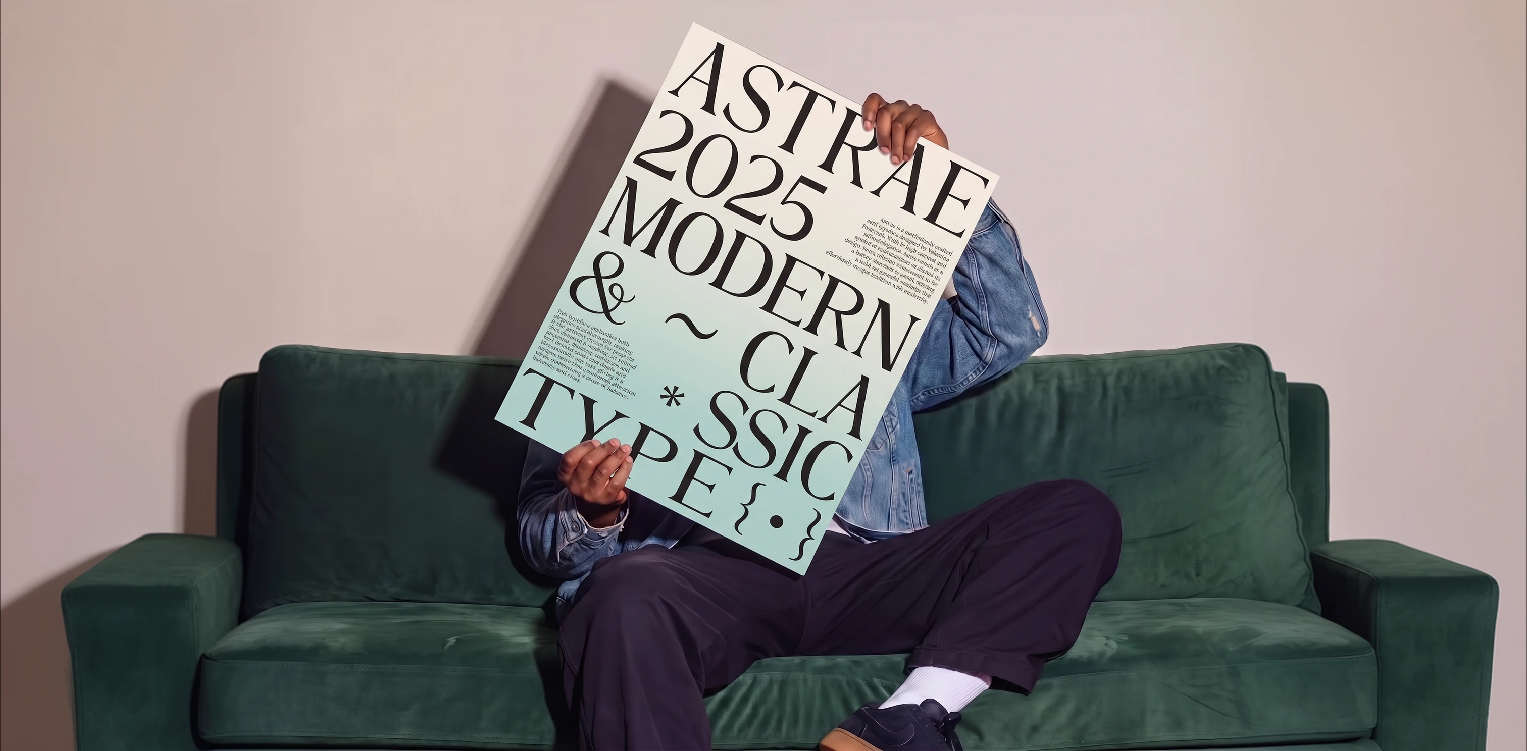
A serif that shines
without shouting
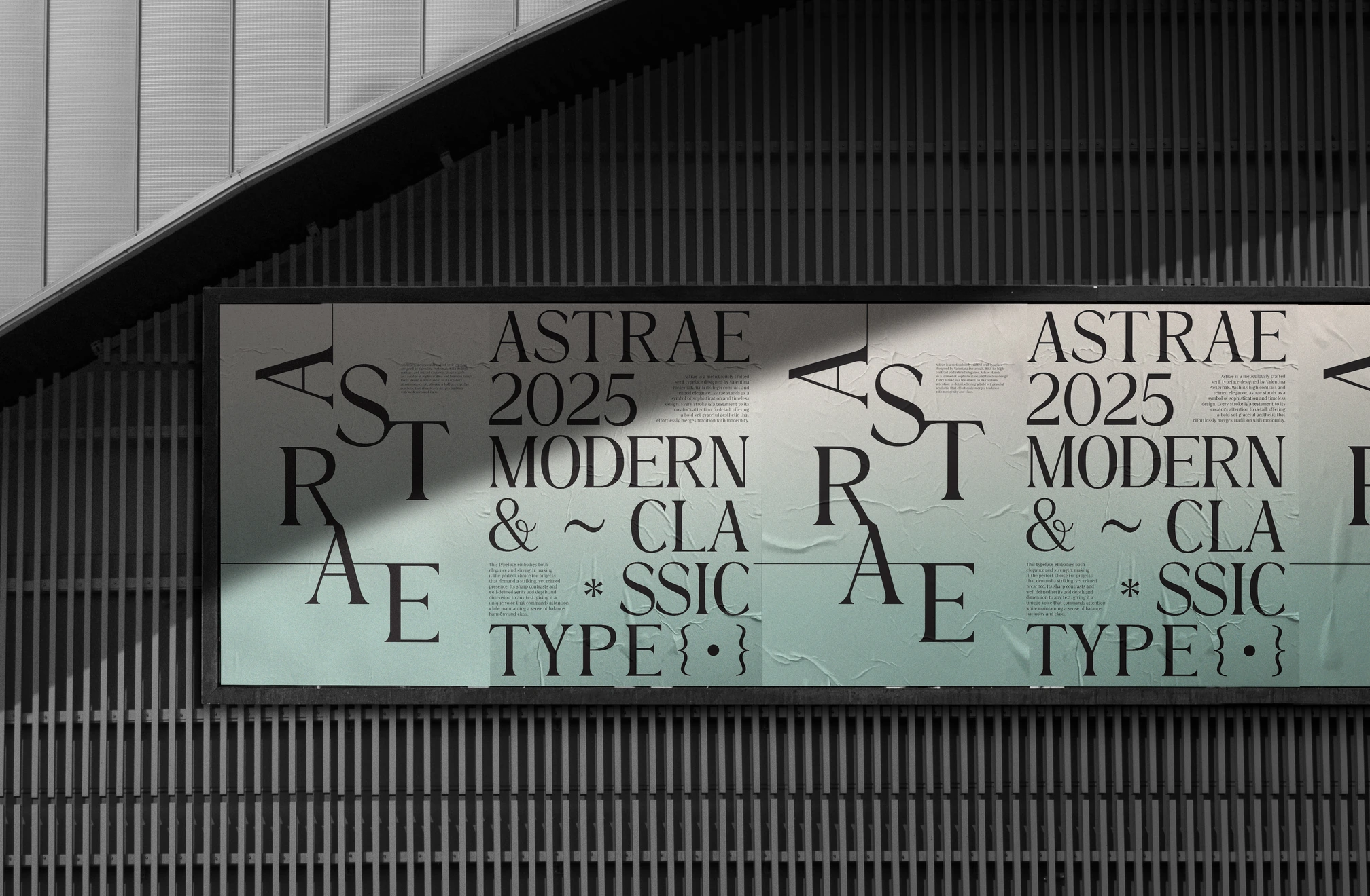
Astrae is a high-contrast serif typeface designed to balance classic elegance with a contemporary sensibility. It was created for natural and cosmetic brands that want a refined, premium presence without losing clarity on labels, packaging or campaigns. The name comes from the light of the stars: a typeface that shines without needing to shout.
Design Process
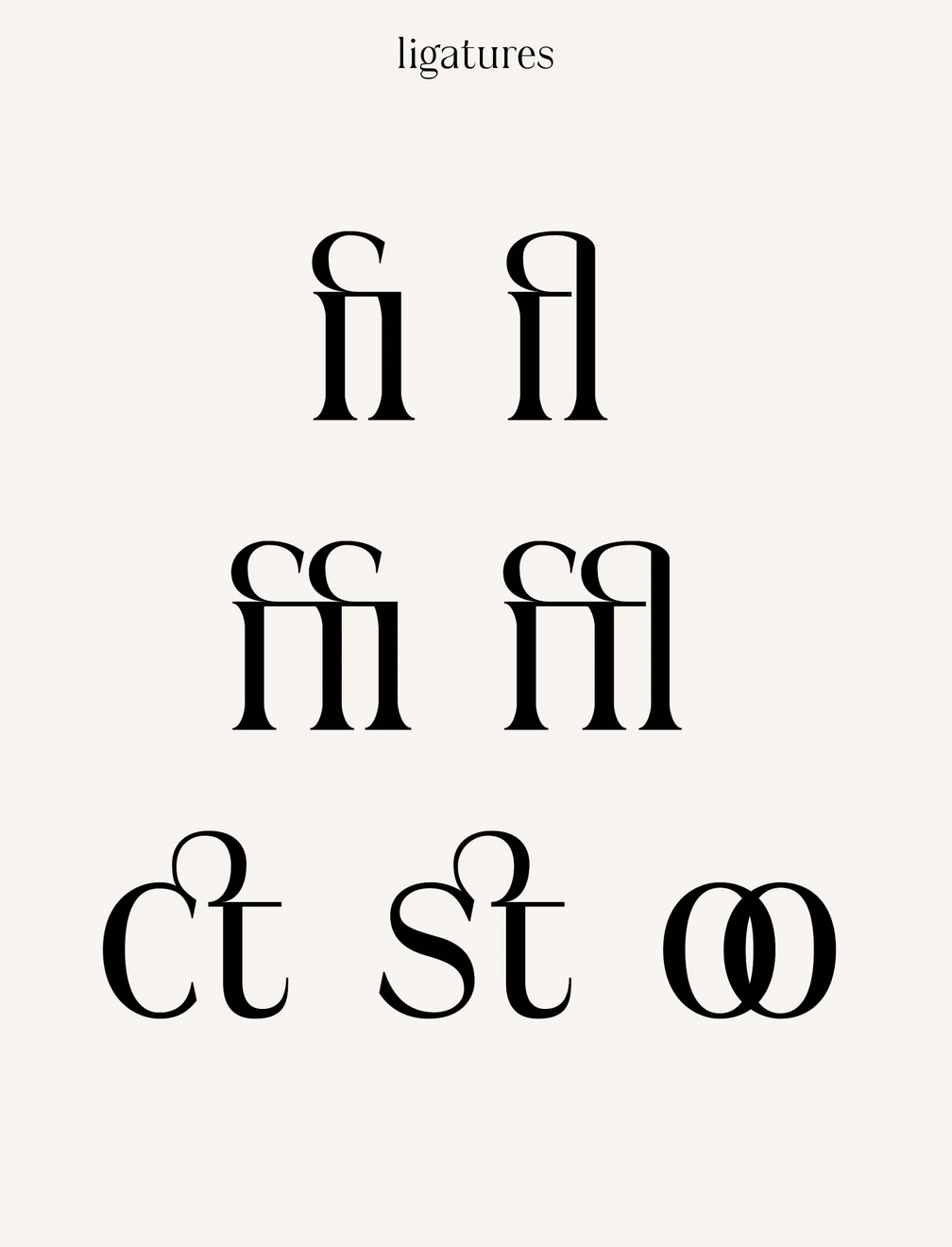
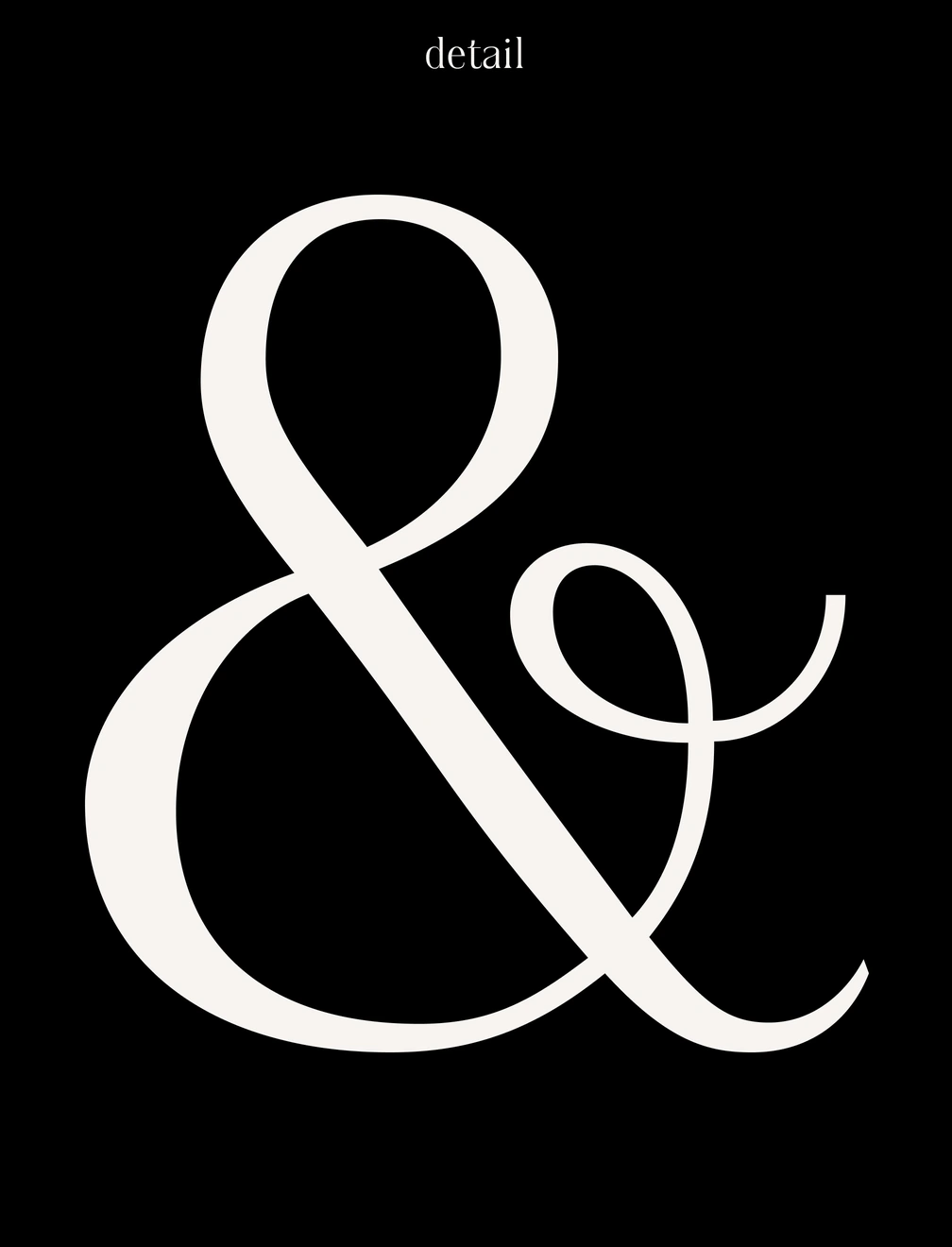
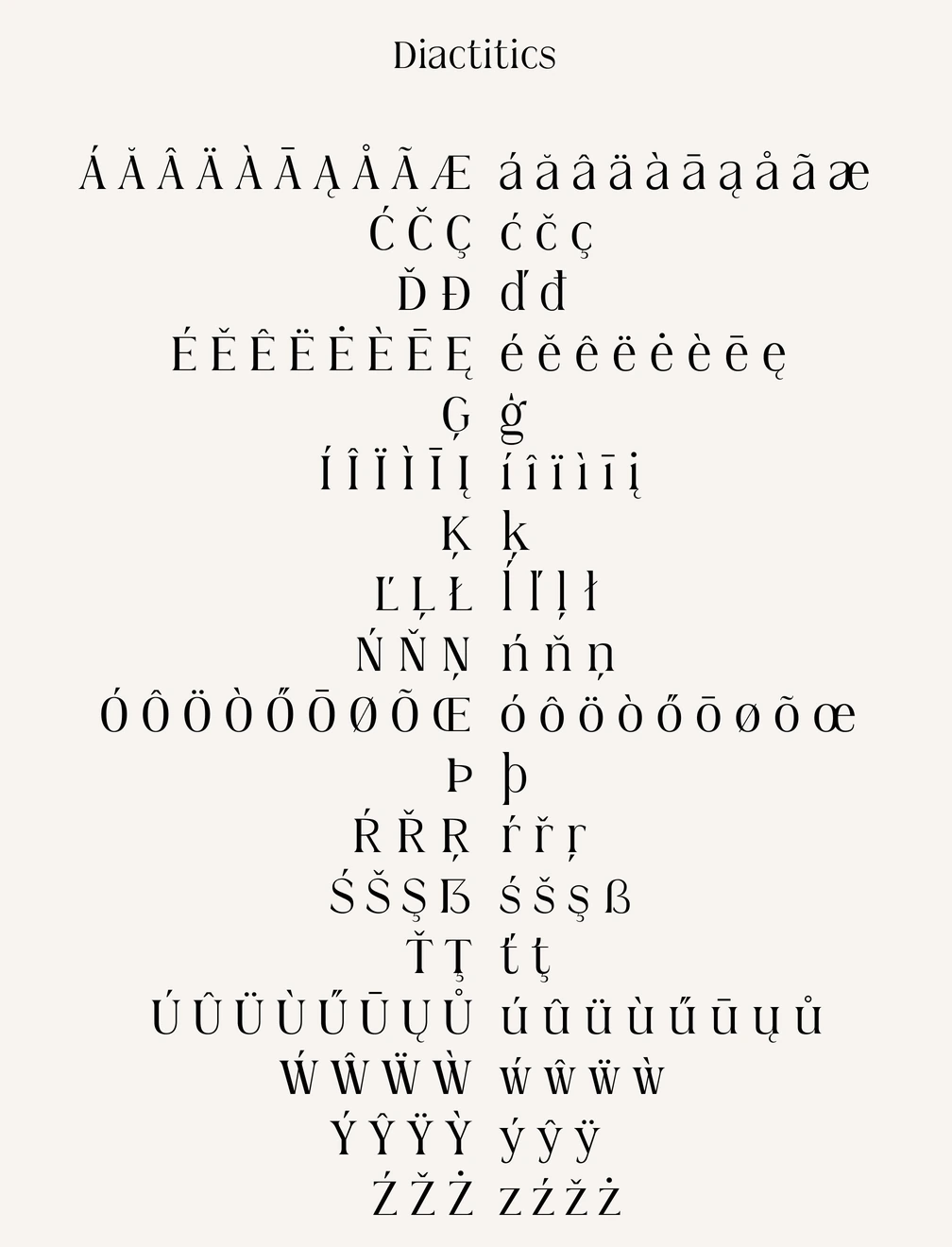
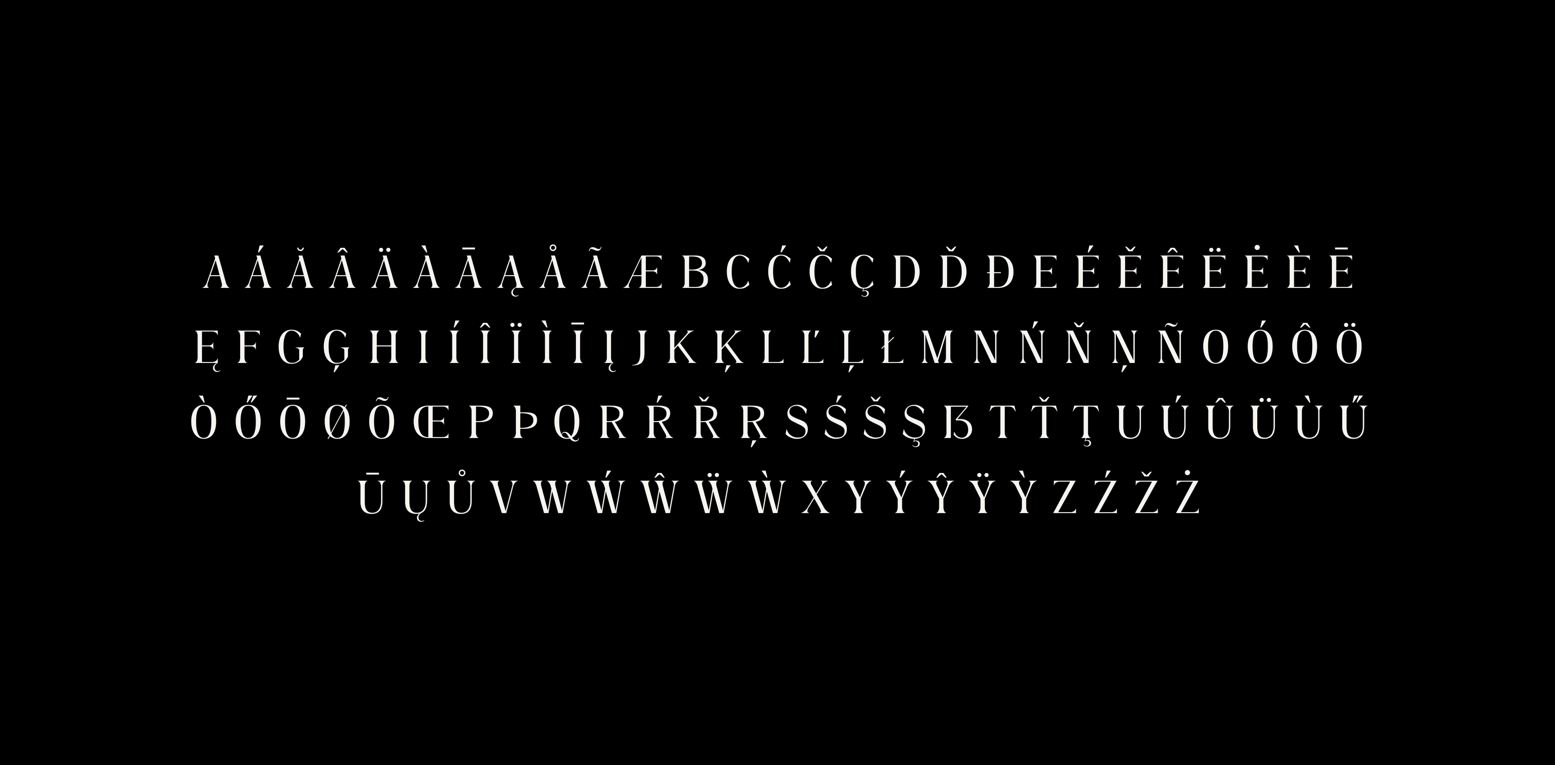
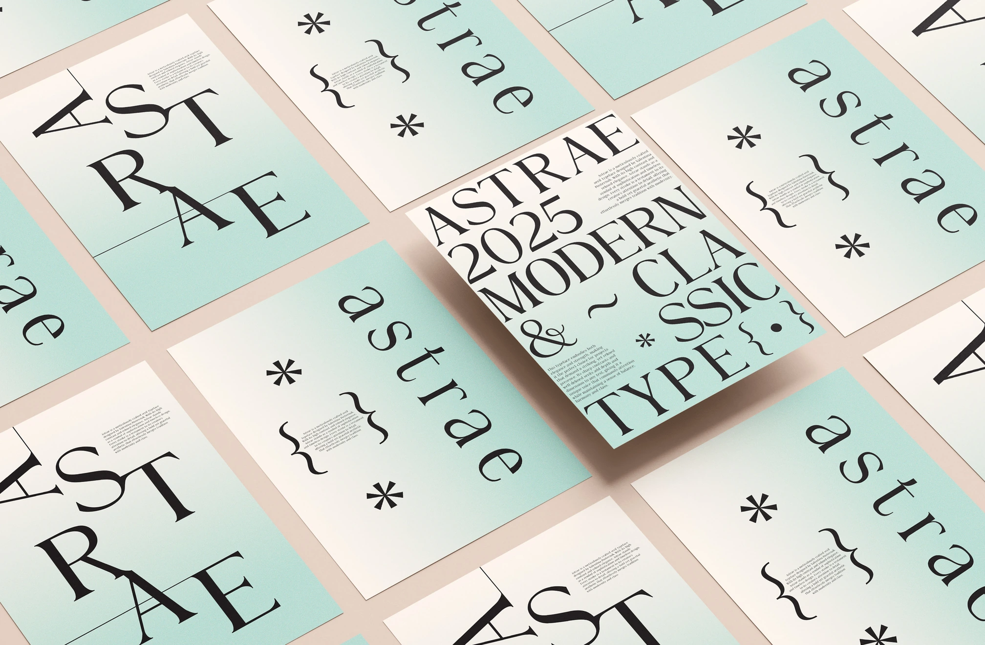
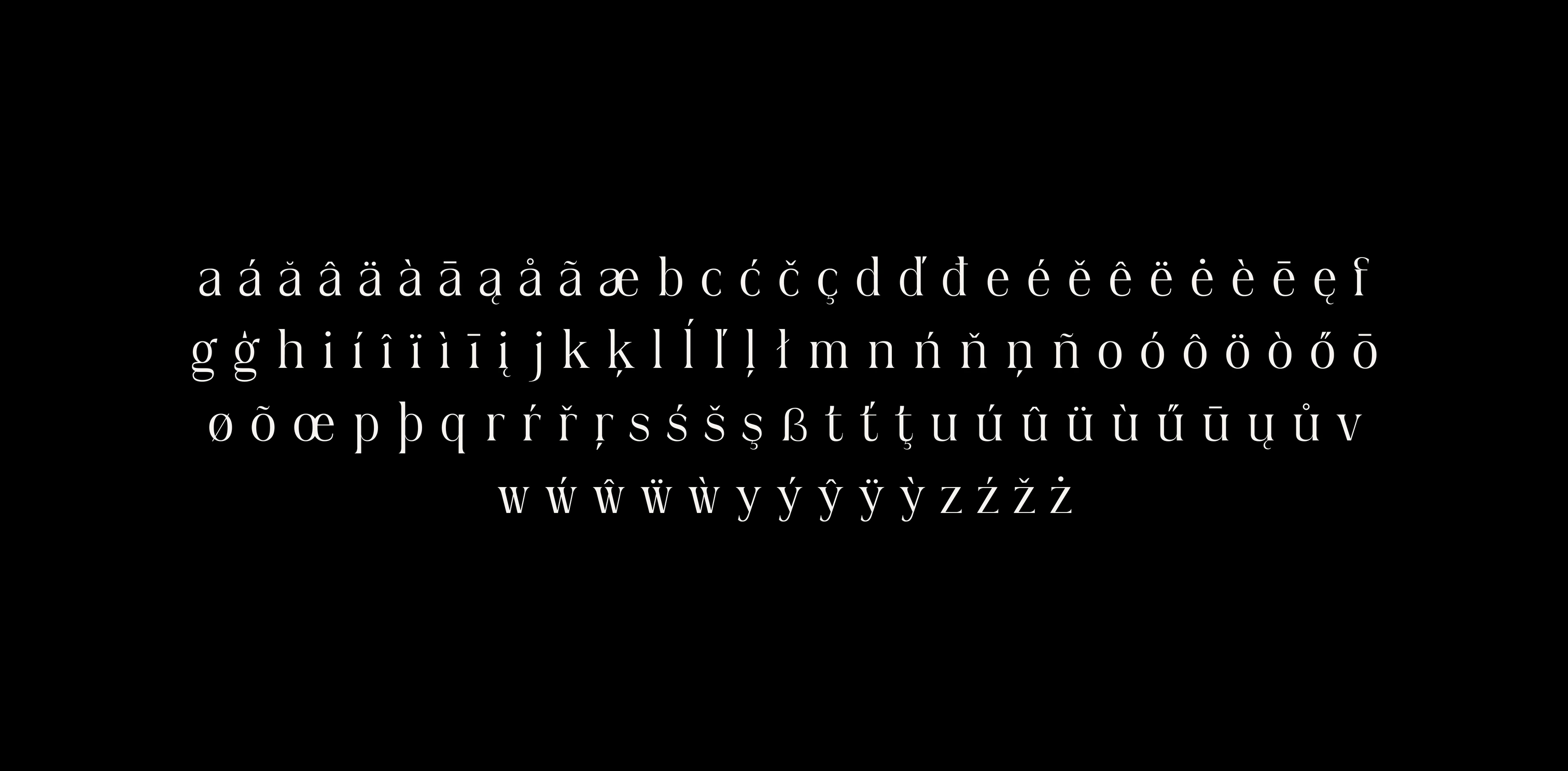
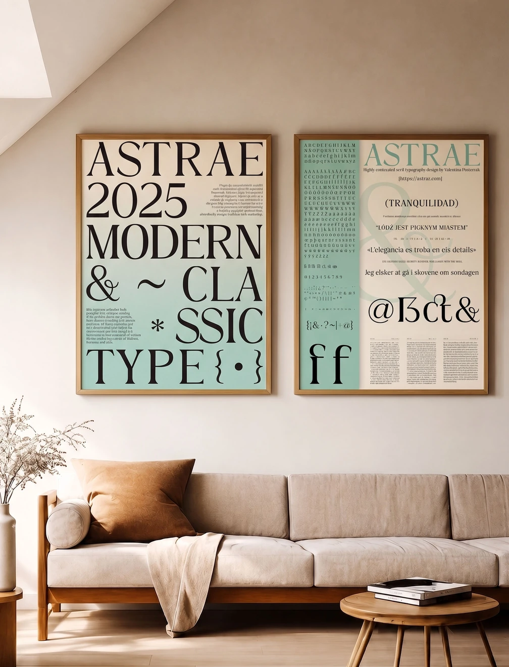
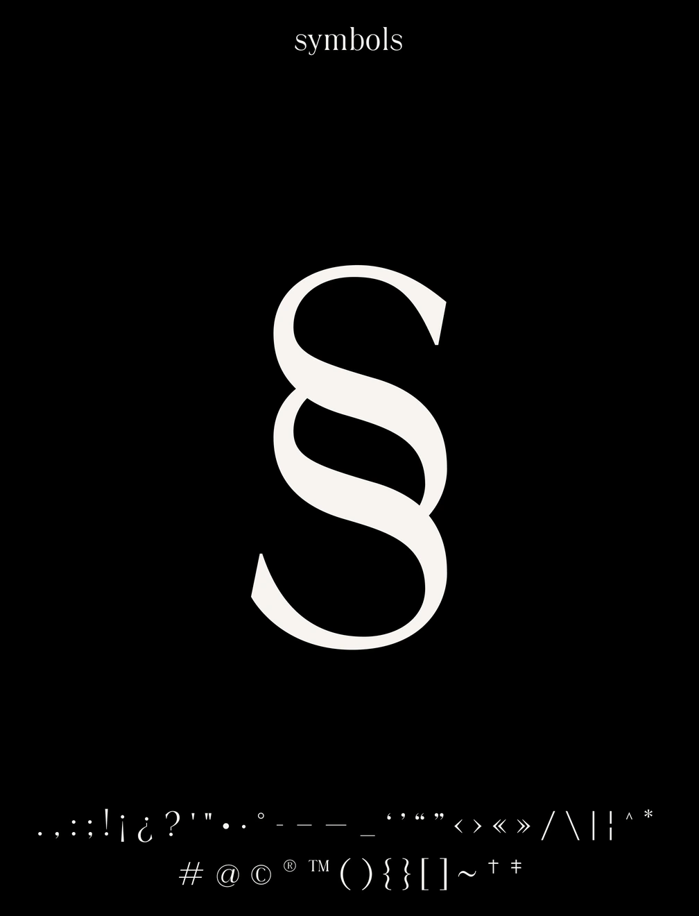
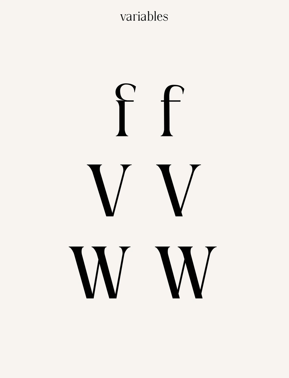
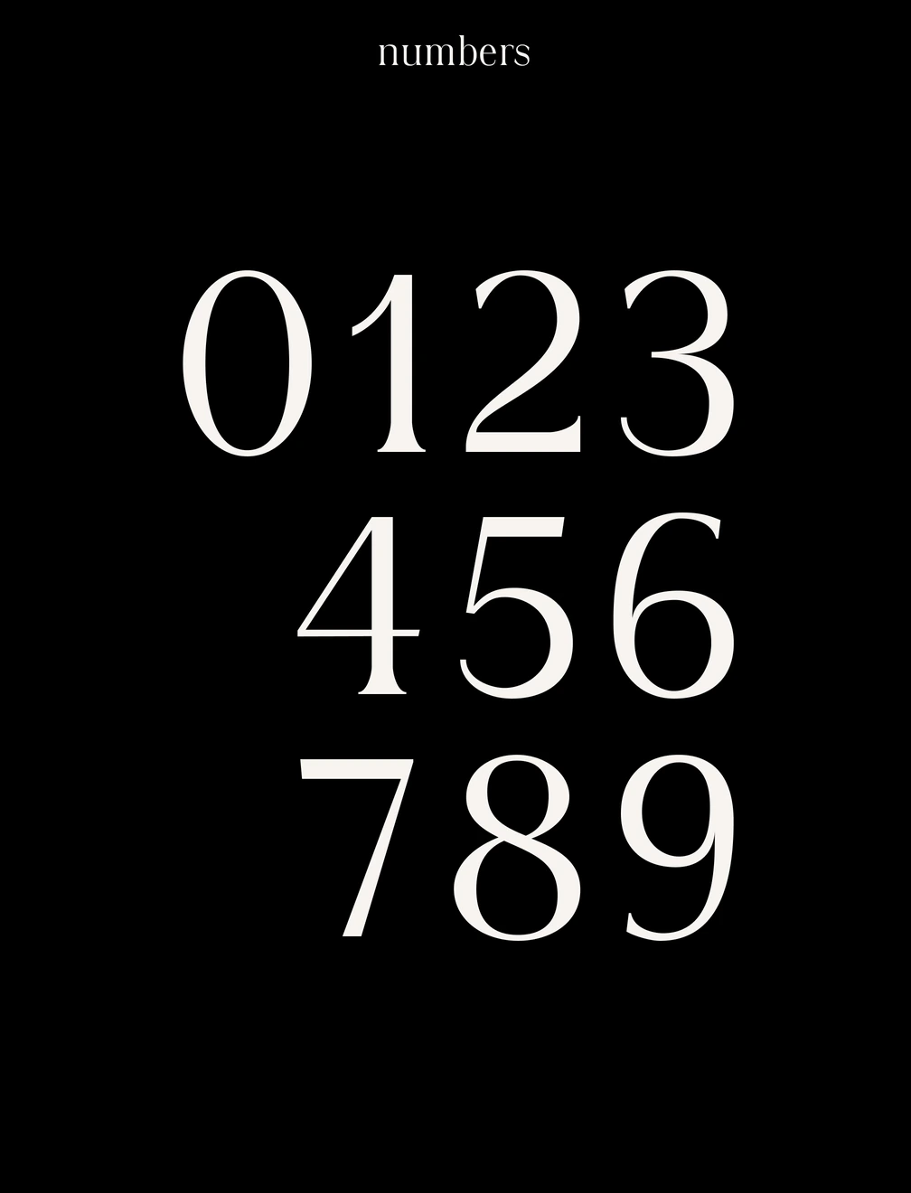
The process began with pencil sketches of key characters, which were then digitised and refined node by node in Glyphs. Particular care went into balancing the thick and thin strokes, keeping the serifs fine but legible at small sizes, and adjusting the overshoot on curved letters such as O and C. The result is a full character set with accented glyphs, punctuation, mathematical symbols and alternate characters, tested across several languages and applied to a series of posters.