Fernet Branca
2025 | Branding

Con Acento Propio
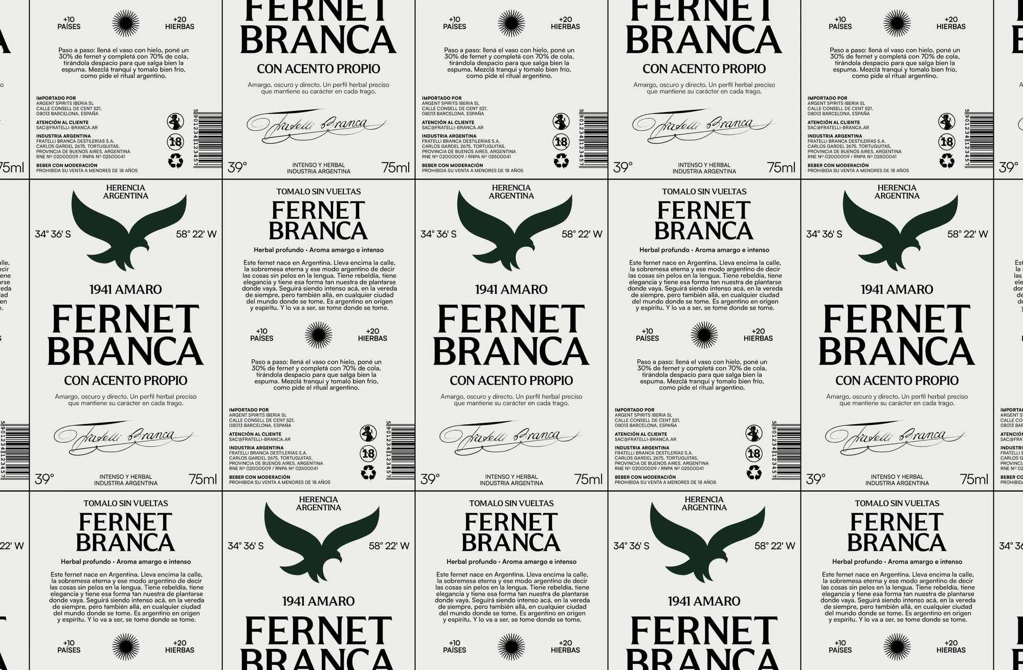
The rebranding repositions Argentine-produced Fernet Branca as a brand of its own within the Branca universe. Built for its arrival in Europe, it centres on the previa, the shared moment before going out. It presents fernet con coca as a ritual worth exporting exactly as it is. The concept, Con acento propio, defines the whole brand: a drink that keeps its flavour, character and voice wherever it goes.

Visual Identity
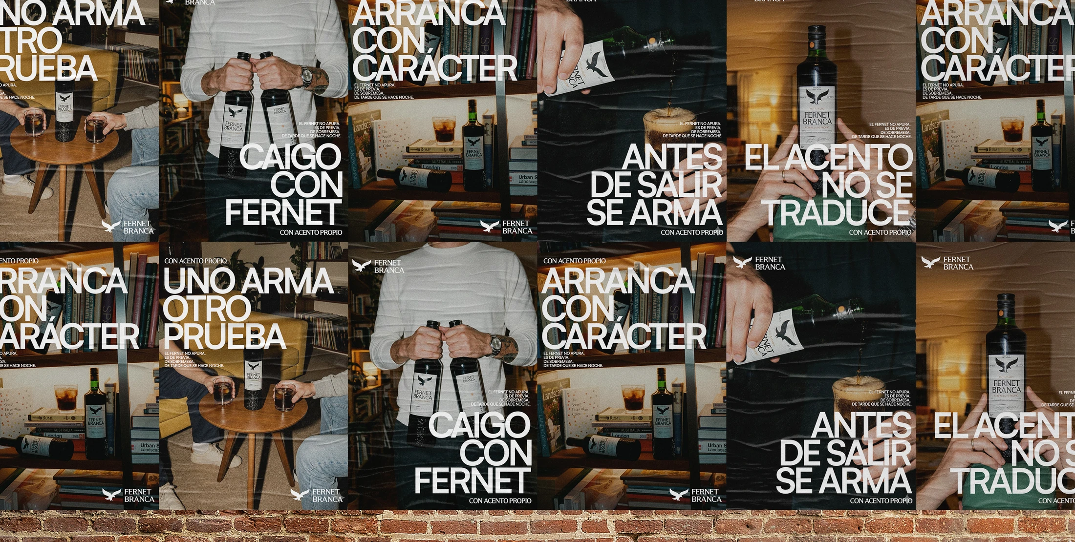
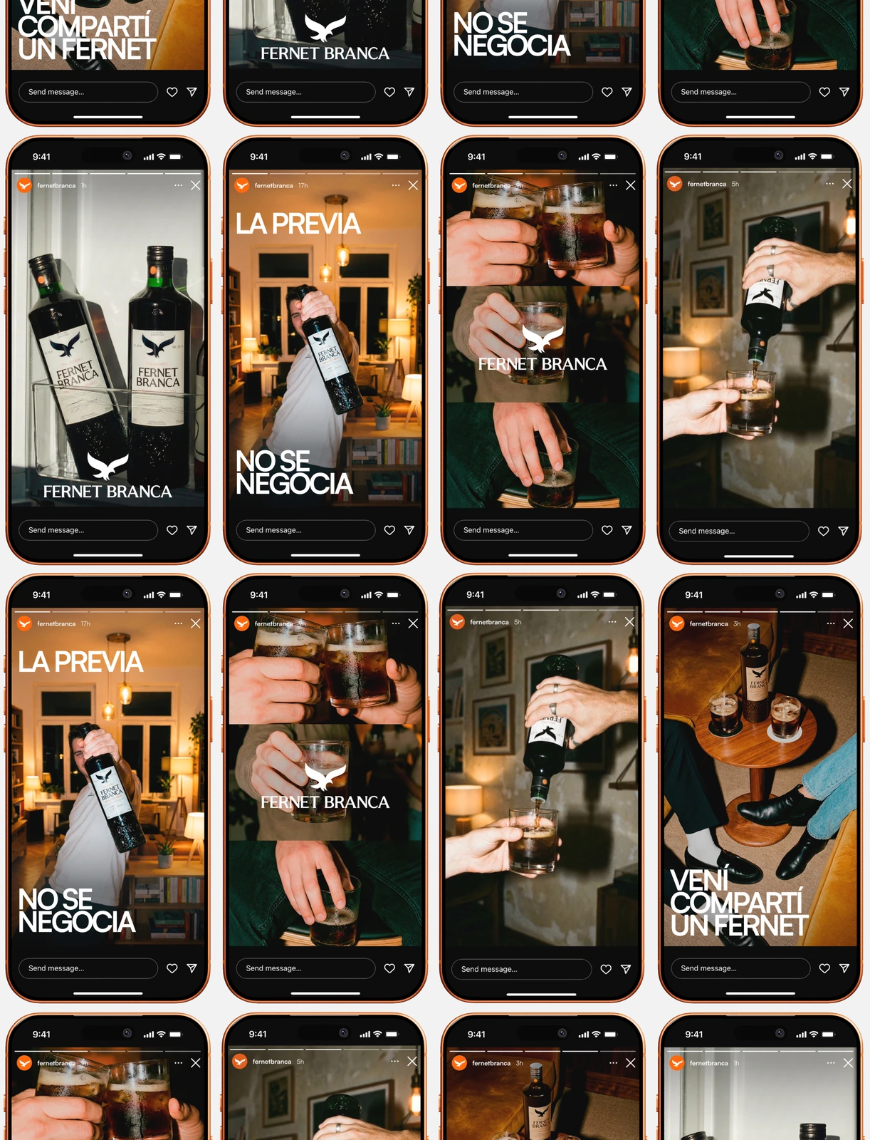
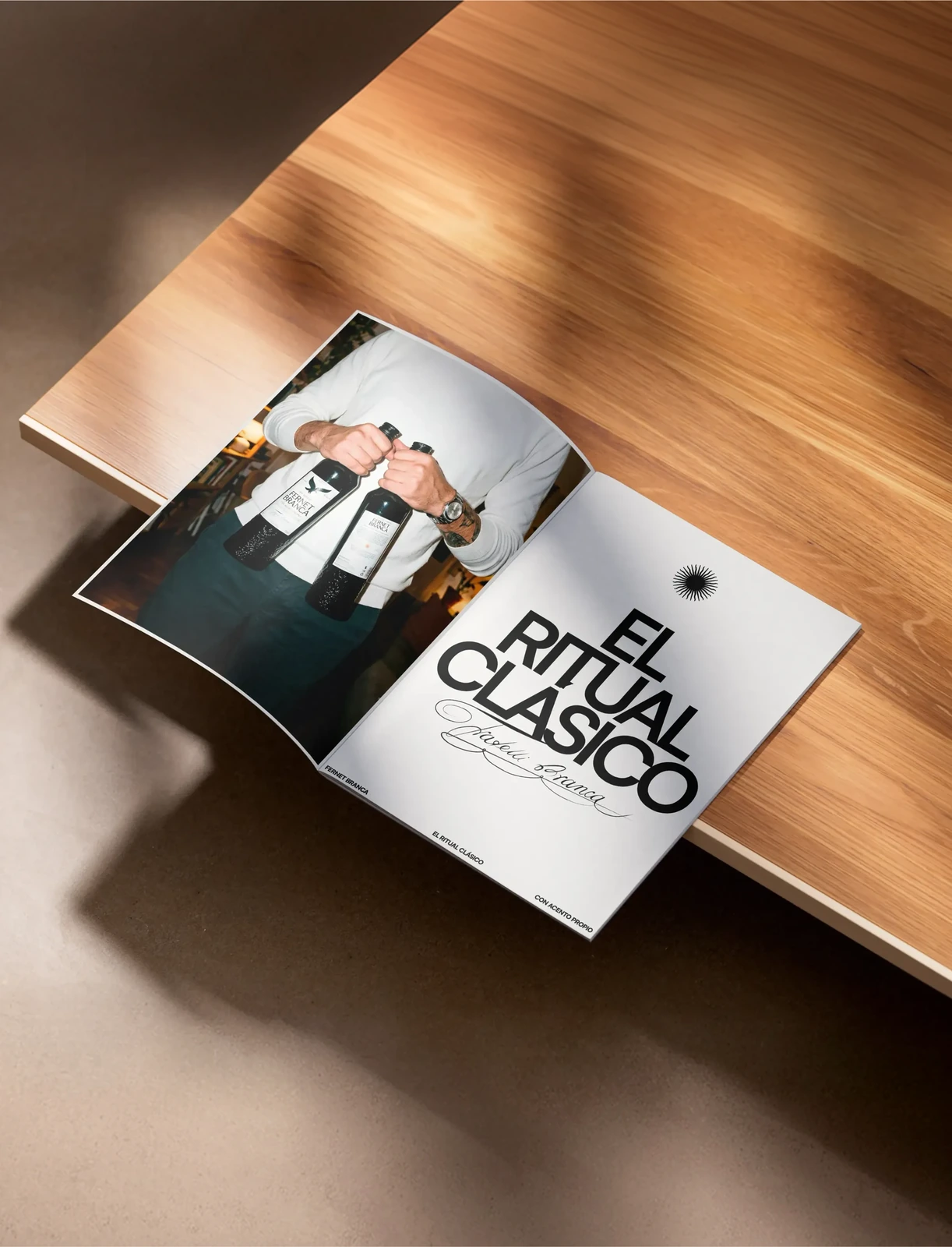
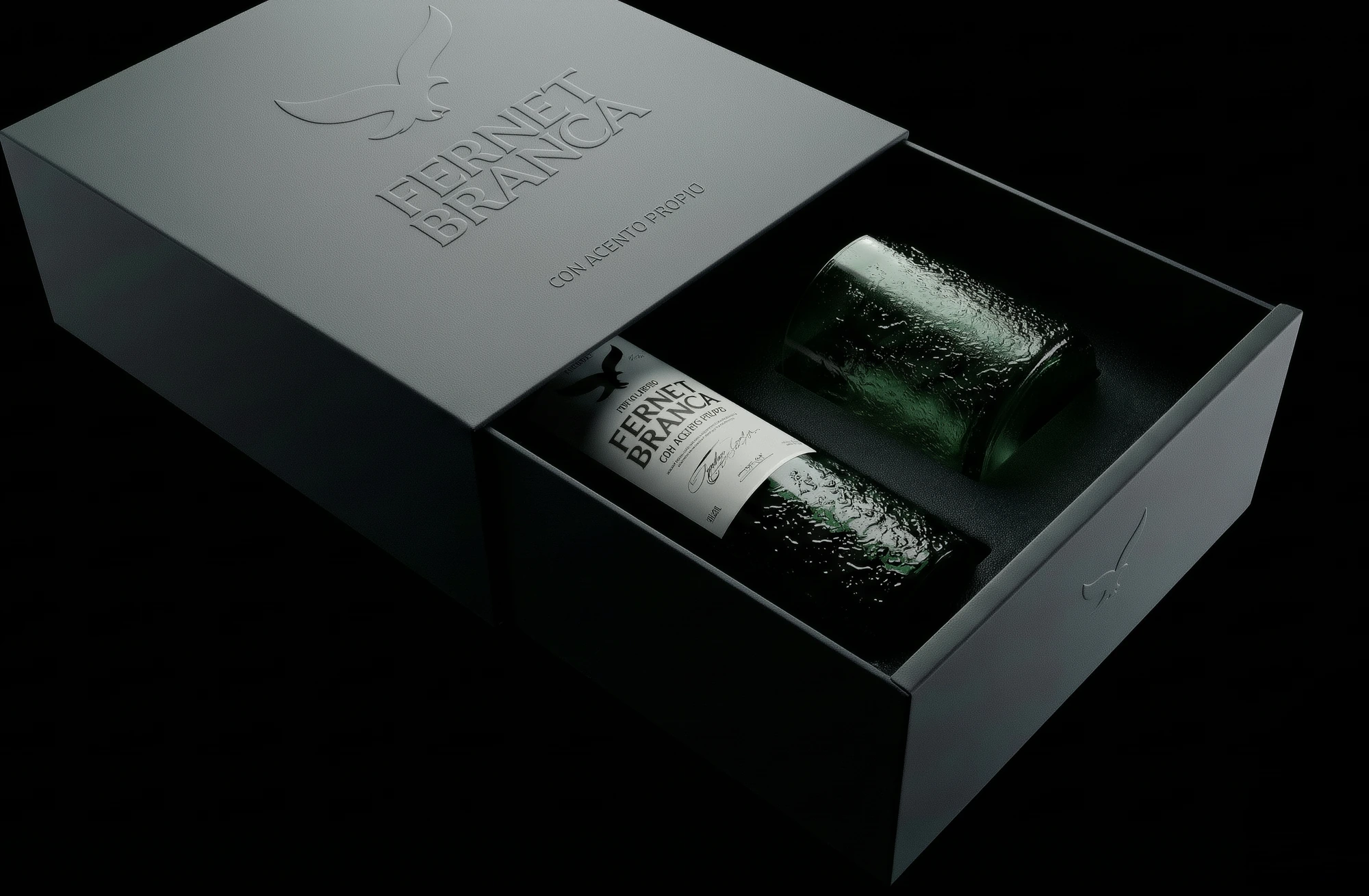
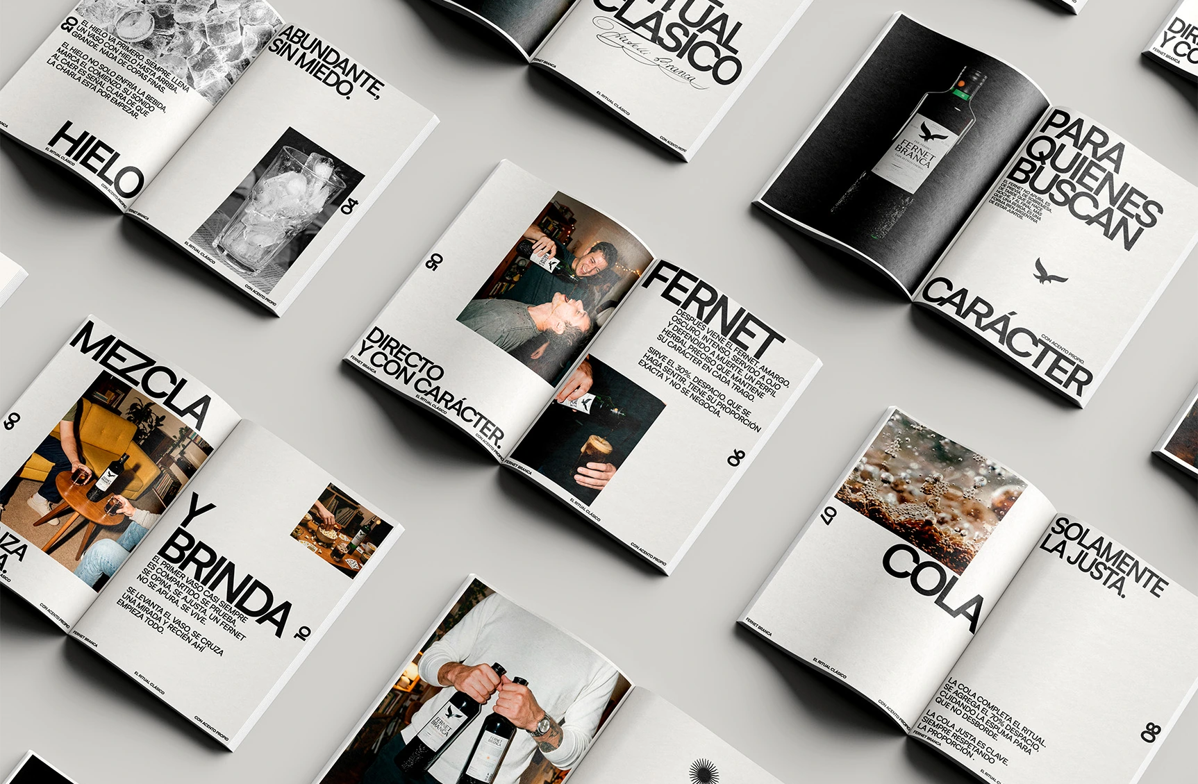
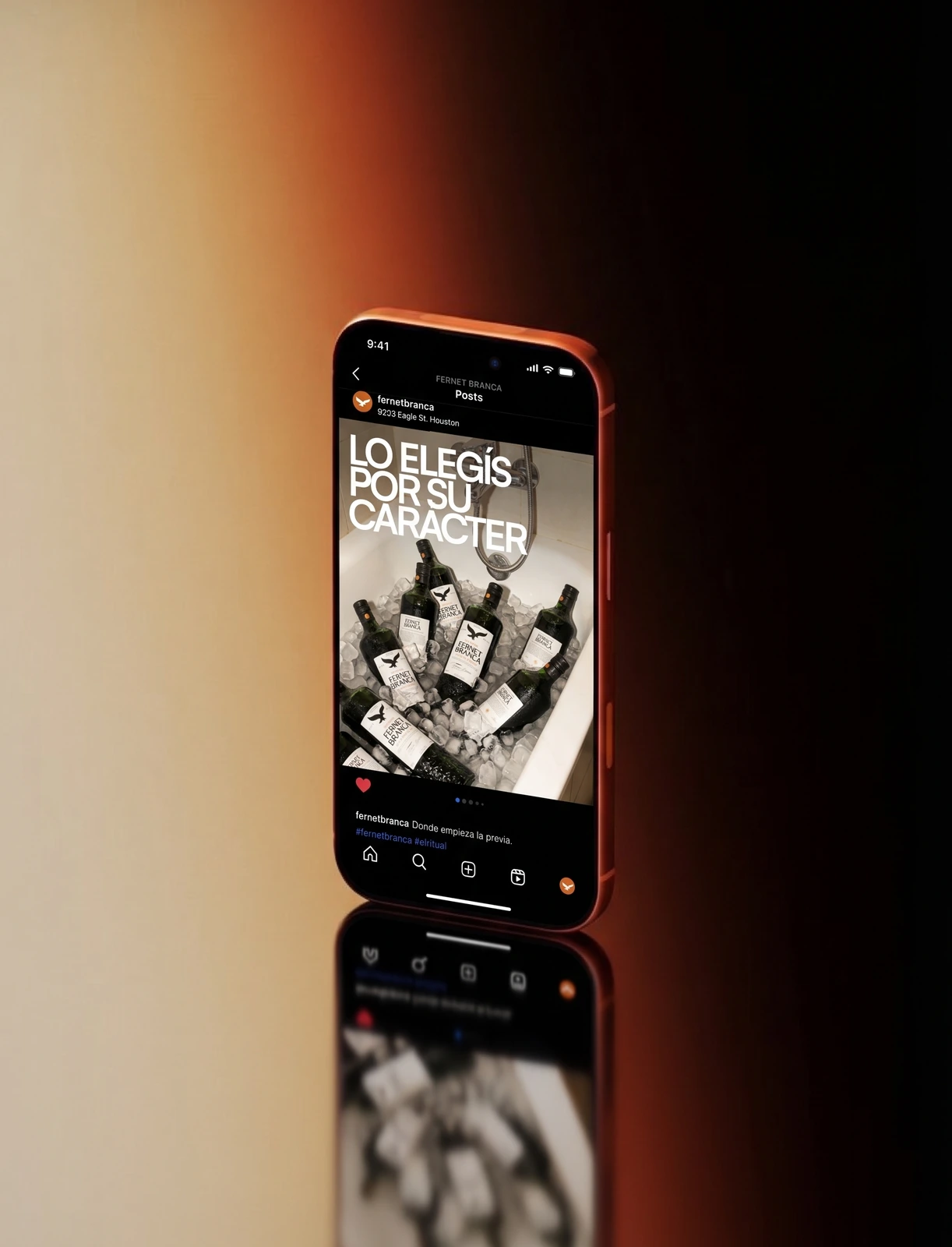
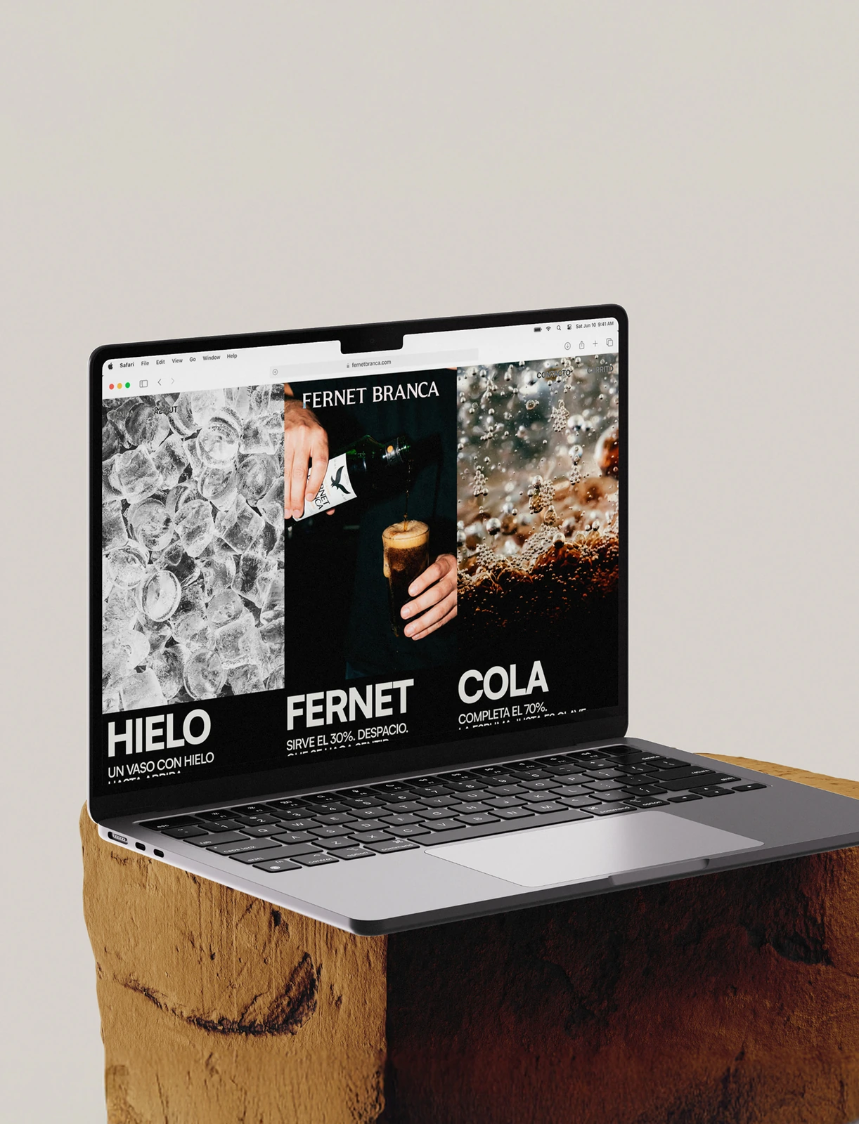
The identity refines the brand's most recognisable codes instead of replacing them. The logotype is a custom serif, the historic eagle is simplified into a bold isotype, and the Argentine sun works as a mark of origin. The palette is reduced to black, white and orange. A textured green bottle and a high-contrast label connect heritage with a modern shelf presence. The art direction is warm and nocturnal, and a typographic campaign written in Argentine Spanish carries the system across packaging, posters, social media, editorial, web and app.